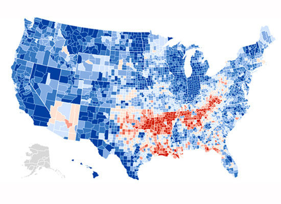
This map shows voting shifts from 2004. Areas in blue shifted towards Democrats, while areas in red shifted towards Republicans. The darker the color, the more pronounced the shift.

::The right to be heard does not equal the right to be taken seriously::
::A noble spirit embiggens even the smallest man::

No comments:
Post a Comment